署名-禁止演绎

10.1万 3 10.1万
1. Concordia School Ningbo is is a joint venture with characteristic concept .According to its "Y-type development of comprehensive personality education", we formulated the Logo vision of "tree" shape. With deep roots and luxuriant leaves, The tree Logo express the meanings of educating, growing and thriving. Red and blue as main color represented vitality, glory and preciousness, highlighting the sense of value.
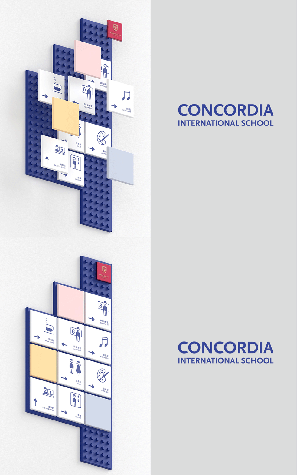
2. The guide board design selected children's favorite "LEGO" square elements .On the one hand, it could inspire children's interest and creative thinking;On the other hand, it could be reused and replaced according to actual application.
3. The guide icon is a gentle and concise cartoon style, which is more closer with students
协和学校是一所中外合资的双语学校,我们根据学校特色理念——“Y”型发展的全面人格教育,推导出logo主视觉”树”,根深叶茂,体现育人、成长、欣欣向荣的意义。红蓝主色,代表朝气、光荣、贵重,凸显价值感。为了激发小孩兴趣、思维碰撞的理念,在导视牌设计上选用儿童最喜爱的“乐高"方块元素,同时具备在不影响指引的情况下,能够重复利用与更换,便于学校根据实际情况调整。专属的导视图标,是偏向柔和简洁的卡通风,以贴近与学生之间的距离。